Flatlands for Nokia Belle
Flatlands is a theme for Nokia Belle phones created in an attempt to refresh the appearance of the OS, hence the three simple design principles it is based upon: colourfulness, clearness and joviality.
Origins: The new interface is inspired by Apple’s iOS 7 visual renewal and is named after E. Abbott’s “Flatlands” novel.
Most of the elements have been flattened, the shadows and the outlines have been removed, and the colour scheme has been simplified, leaving just the essential, driving distractions away.
The metaphors have been revisited and improved, and they now have purer forms, letting the user explore something new, yet familiar.
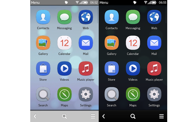
There are two versions of the theme: Flatlands, which is light, and Shadow, which is dark.
Colourful: While the interface has been simplified, the icons have become more colourful, as a compensation, making it a pleasure to use the phone. The new and assorted colour palette is playful and cheerful.
The gradients in the icons now use subtle colours and smooth transitions, allowing for more variations and a unique style.
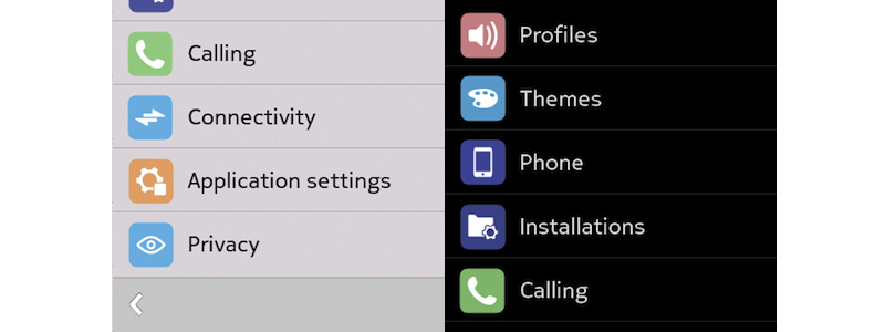
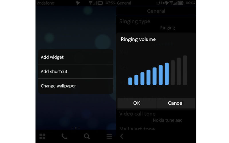
The Settings app has new, beautiful icons.
Functionality: The transformation and reduction of certain elements improves functionality and helps the user focus more on the task.
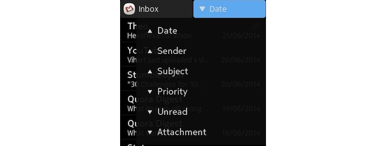
For example, the sorting drop-down menu in the Mail app now only displays the arrows pointing the hierarchy. The base of the triangle represent the top items and its tip, the least.
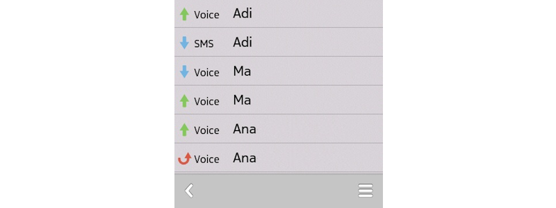
Adding colour to the arrows indicating the communications’ direction speeds up a search, as a missed call is red, an outgoing connection is green and a received call or message is blue.
Transparency provides a sense of awareness, as it allows the previous screen to be seen, whilst not stealing the focus from the front dialogue.
The dialogues are a little less opaque, the graphics don’t superimpose.
Details

The Gallery icon now represents two square photographs, as the thumbnails in the grid also are squares.
The idea of Messages is suggested better with a speech bubble.
And also an envelope makes more sense for mail. A deep blue is a good choice here, because it represents the sky, as radio communications traverse the Ionosphere.
Nokia Maps now has the Here Maps logo, but it keeps, according to the spectrum guidelines, the green colour for navigation.

The system icons are generally improved and retain the original glyphs, while shadows are reduced and gradients are replaced subtly.
The Camera icon is flat, but there are gradients in the lens, suggesting a reflective surface.
A lined notebook represents the Notes application.
The Radio icon has a new gradient and the tuning bar has adopted the theme-wide “focus” colour - a light red nuanced with orange or an electric blue.
My favourite icon - for the Settings app! The shadow is small and the wheel only has three grey colours, so that its simple, but beautiful shape is in the spotlight.

Most of the third-party icons are composed of a gradient and a white glyph, which partially fades in the lower part, revealing a bit of the colour from below.

The general Phone icon is now smoother, so that the rectangular screen is more evident. Also, the button is centred and rounded. It can be found in Settings throughout the system - Log, Contacts, etc.
The alarm icon from the Notifications Tray now shows a round clock.
Resetting is represented better by a round arrow, as it points to a beginning.
As a week has seven days, putting the number 7 in a clean font in a rounded square suggests the Week view in the Calendar. The same design is applied to Day and Month views. Twelve is the number of months in a year, so it is suited to the Calendar Settings icon.
Vector Quality
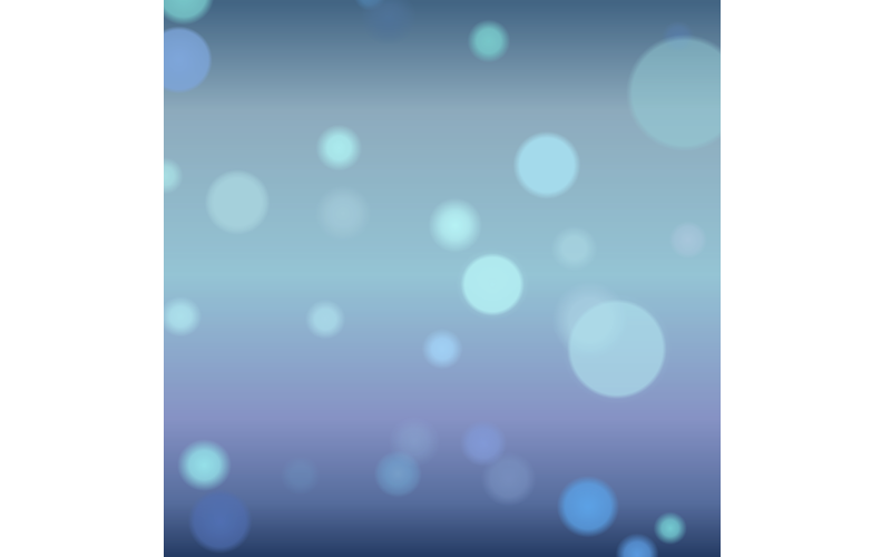
Using only Scalable Vector Graphics for the theme means an uncompromising performance and excellent quality, while keeping a small file size. Vector images can be scaled infinitely, so that they will look great on any screen, including Nokia E6’s. The wallpaper above is a vector exported as a bitmap.
You can download an assorted wallpaper pack at the bottom of the page.
Screenshots
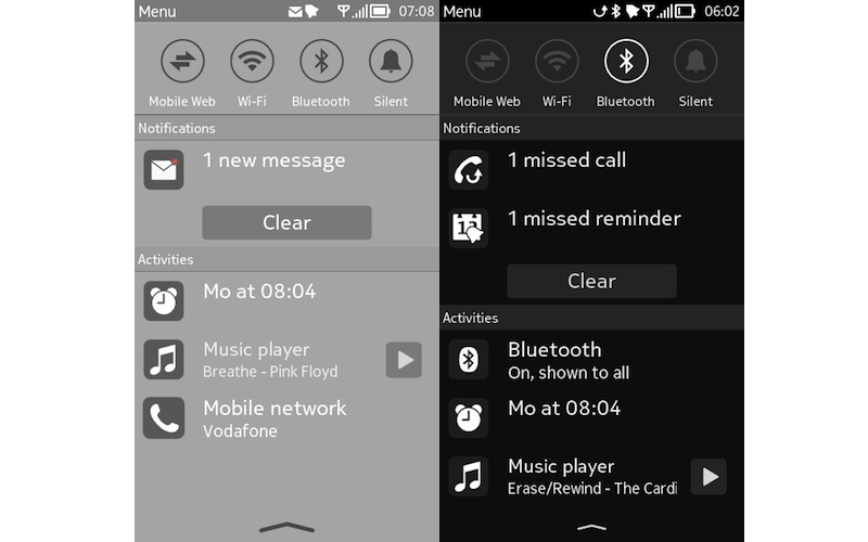
Drop-down Notification Panel
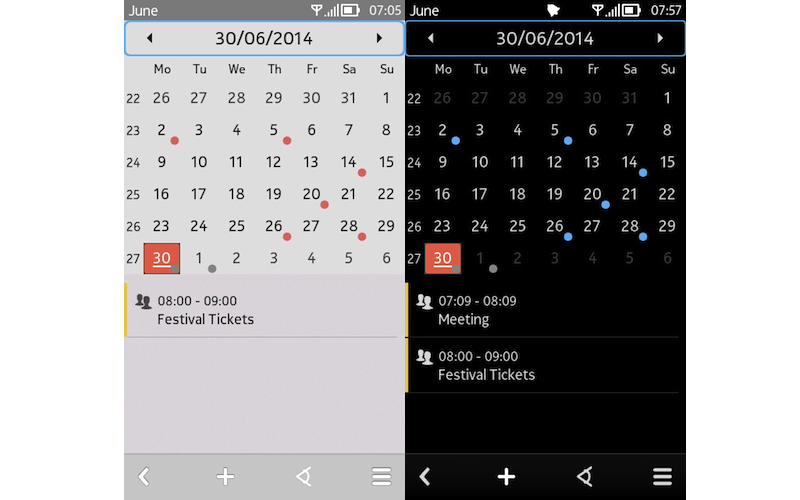
Calendar app
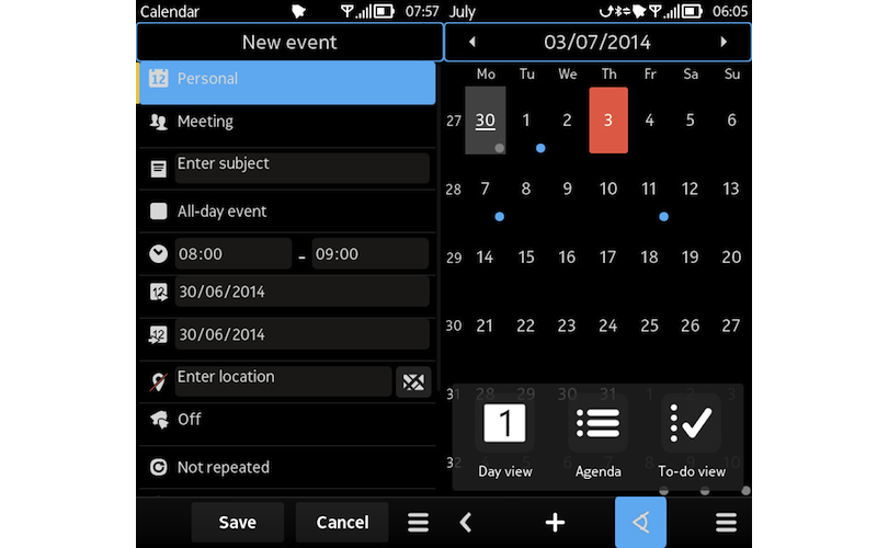
Creating an Event · Calendar Views
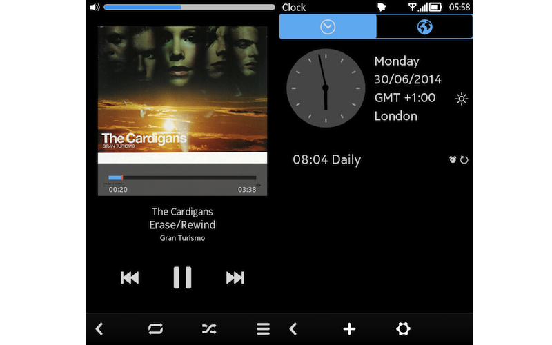
Music Player · Clock app
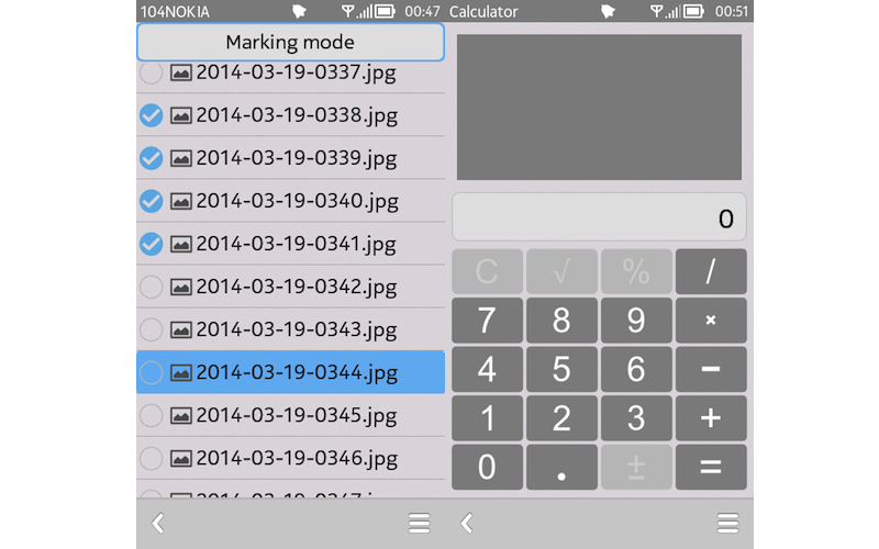
Marking Mode · Calculator
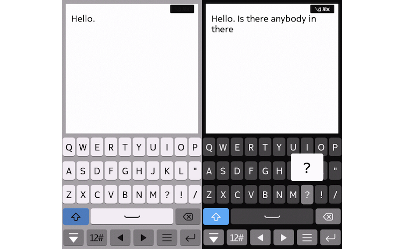
Full-screen Keyboard, with bigger buttons for easier and safer typing
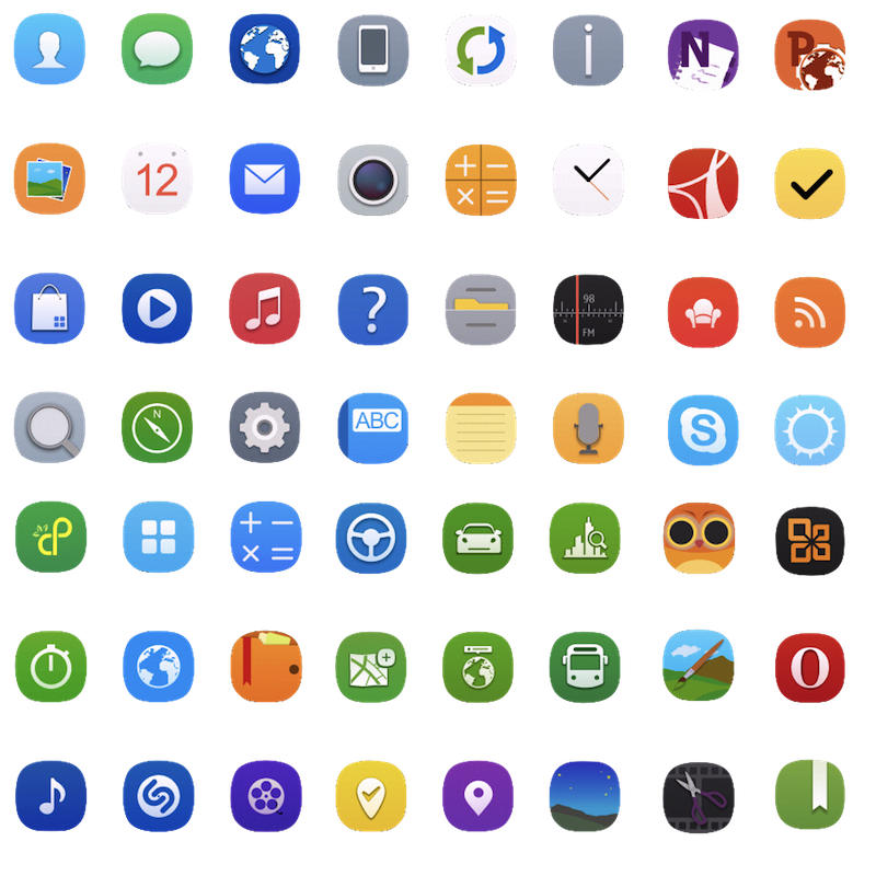
Third-Party Icons are supported and so far there are 250. You can contribute, too! I need a list of the desired App, a link to it and a UID. The procedure is explained below.
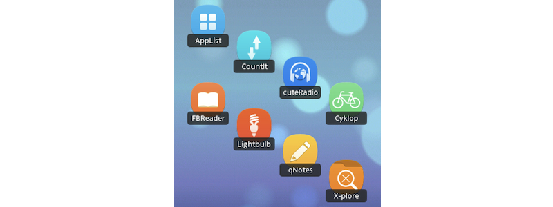
There aren’t just apps from Nokia Store, you’ll also see icons for programs from AppList or other independent developers.
How to submit a request:
First, to find out the UID of your apps, get AppUidViewer from here and install it on your phone. Then open it, go to Options>Search UIDs, and you will get all the ID’s. Please look on my list to see if the app you want is already there. If it’s not, use this form to send your apps - you will need to provide the application name, the UID, the link (to Nokia Store) and the type of app.
Beware, however, of Java applications and games, as their icon cannot be changed through themes.
Constant Updates

As the requests are sent, I will try to release an update every month so that you will have your app icons themed and most of the issues will be eliminated.
You are free to use this theme and shape it to your liking, under the condition you will give credit and use the same license if you redistribute it. Thank you!
Github source: Flatlands · Shadow

This work is licensed under a Creative Commons Attribution-NonCommercial-ShareAlike 4.0 International License
By the way, the style of this article is just a mockery of Apple’s product presentations, so treat it accordingly. ;)